The most significant part of the No More Wrong Turns article for me was a picture of a dark street with a light shining out of a building onto the porch. The lesson was teaching that the light is a guide to the user to approach that area of the map. Of course, the game doesn't tell the player to do anything, but assumes that the player is drawn to the light (more specifically, the contrast).
I remember reading stuff like this on GodlyPerfection's lessons, but it was that picture that made the whole thing come together for me. And it was at that moment I asked myself, "How can I do this on Reach?" After all, the Light objects bleed through everything and you cannot change the ambiance to night time.
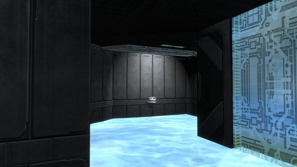
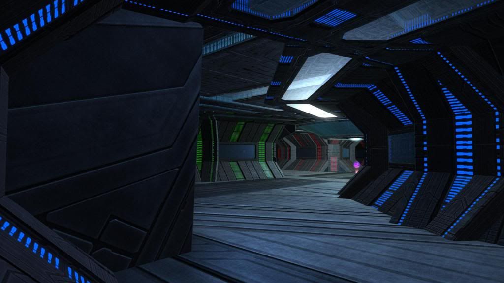
Then a stroke of fate - I was forging with ToxicJesterVII and he was showing me some of his earlier works. In one of them, he showed me a lit room in the round bunker that clearly drew a player's attention to a weapon. This was the example I was looking for - the one example that showed a dramatic demonstration of how to make the effect talked about in the article. If you look at Picture A, you will see that the light from a 2x2 corner piece overhead creates an oval shape lit area on the otherwise dark wall. The shape of that light on the wall, along with the dramatic contrast, make clear to the player that the light was positioned there for a reason. Of all the maps I have played on I have never seen anything that was this dramatic - I have never seen any lighting effect stand out like this.
So now that I had an idea of what I needed to make this effect occur on my map, I kept an eye open for such opportunities and began experimenting as well. Finding the opportunities of a dark location are not as difficult as I had always thought. On my current forge work, I found that I can use this same approach on a darkened Coliseum wall out in the open (the Coliseum wall is buried nearly 90% into the ground up on the Quarry, that is why it is nearly full black). I can apply a light from below and a contrasting white object in the center of the long black wall, such as a health pack, and the contrast is very strong and localized. See Picture B below.
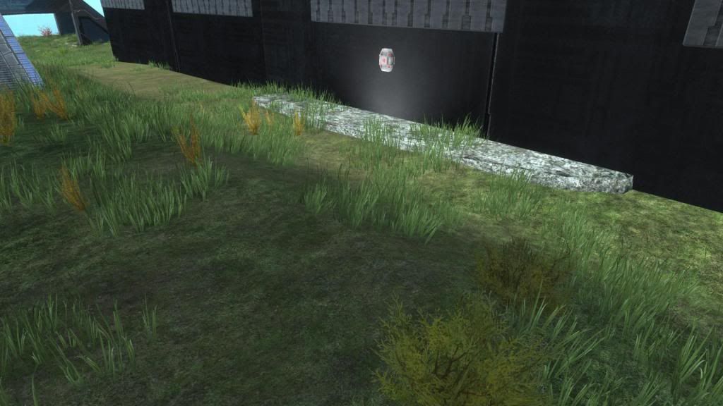
Picture B - White On Black Lit By A Buried 2x2 Corner Piece
As I continued forging, I placed a 2x2 corner piece at the end of my base as a corner to attach a ramp to. I then saw how effective it also worked at lighting up the cubby hole area under it, and so I placed a sniper there - see Picture C. After all, that cubby hole was now going to attract players' attentions, so I should put something valuable there to attract their attention to.
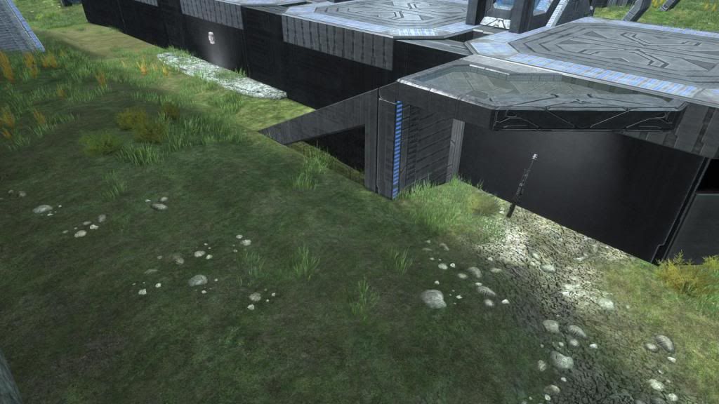
Picture C - Sniper Under A Light For Players' Attention
I don't think that the light works as well against silver or tan surfaces, and it can be difficult to find or manufacture the dark wall to apply a contrasting light against. But when you have a dark wall, you might consider using localized lights as a way of attracting attention to weapons or other valuable features of the map.
Contrast For Dramatic Effect
As we continued looking at his various works, Toxic showed me several other interesting pieces that I think we can all learn from. In one example, he had a long, vertical tube that a player shoots up on a man cannon. The tube was made of Coliseum walls, so it was naturally dark inside. But he added something - he added the edge of the Coliseum Window, which is shiny silver (see Picture D). This is a small effort and a small overall effect of the aesthetics, but if it fits into the theme of the aesthetics, then it should be added to reinforce the players' immersion into the game.
Picture D - Contrast for Dramatic Aesthetics
Light Objects As An Attraction
Up to now we have been discussing light sources on objects. They are not nearly as strong as the Light objects themselves. Light objects are so bright that they reflect off objects after the light has traveled through walls. Light objects tend to bleed through objects, which makes them difficult to localize a player's focus on a weapon or other small feature of a map. But I want to show an example of how reflection of a Light object is very powerful in getting a player's attention to help guide them through a map.
Picture E is a screen shot of the inside of Arcade by The Xzample. This screen shot can show a number of things about level design, such as how sections of a map can be color coded (as Arcade has done) which help players know where they are always. It also shows how dramatic the use of colors can be in a map on Forge World. (Arcade is inside the Coliseum, which has less light than outside to begin with.)
Picture E - Arcade's Use of Light Object Attracts To The Center Of The Map - courtesy of The Xzample
But what I want to draw your attention to is the white light in the center of the map. You can see it in the distance around the corner to the right. But that is not what I mean when I say I want to draw your attention to the white light. I want to you to notice the feeling this screen shot (and indeed being in the map itself) gives. You can feel like it is night time and that the office is closed for the night. The only light on is the night light at the center of the office. You can see the reflection off of what almost looks like overhead lights that are themselves off. This is a pretty dramatic effect and clearly draws a player's attention to the center of the map - it helps give the player a reference point and a guide to the center of the map.
Animated Attraction
I now have my own unique signature on my Reach forge works - the Energy Light. The Energy Light is where you find the Energy Sword spawn from. It gives the impression that the Energy Sword was given birth out of the ground and that it hangs in mid air by the umbilical chord of the Energy Light itself. It is as though you cannot tell exactly where the light ends and the sword begins (see Picture F).

Picture F - Energy Sword Spawns From The Energy Light
The light acts as an animating attractor. It is a teleporter receiver. The sender node is hidden somewhere on Forge World so that no one can pass through it.
When I can, I also place the teleporter inside the center of a 2x2 block and add the kill ball inside the block for additional animated effect, but this is usually not possible with most maps.
Other Concepts Demonstrated
Going back to my forging with Toxic, he showed me a map he made once that had a circular wall. He talked about how the light reflects off only some of the glass, since the glass is at varying angles. But he then began to talk about how you see less of this map than most others due to the circular building structure, and that as you walk along the path, more of the map reveals itself to you. In essence, unlike most maps where you can turn a corner and see a large section of the map instantly, this type of level design prevents large sections from being revealed by a mere two or three steps (see Picture G).
Picture G - Circular Path Prevents You From Seeing A Large Section At Once
A curved wall can give the impression that the further something is from you the less you see of it, and this gradually. You move forward just a little to see something partly out of sight. Once fully insight, you again want to move forward just a little to see the next thing that is just partly out of sight. This concept can create a sense of repetitive curiosity that leads to exploring the map further. How practical it is in creating a level is up to you all, but the concept is very interesting to play with.
Artistic Aesthetics
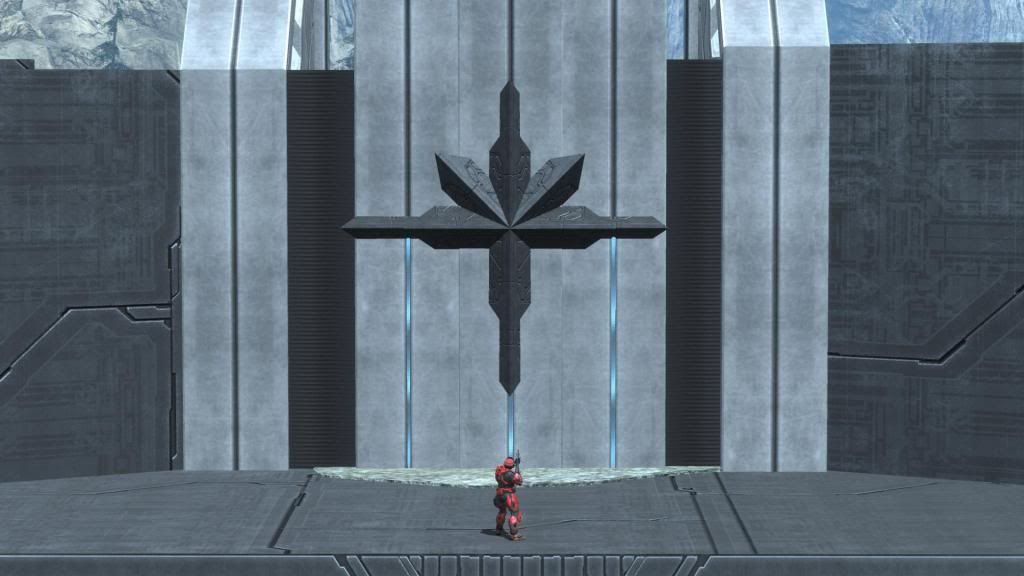
While we were forging, Toxic began to build a Forerunner symbol using the Forge World palette Coliseum Walls, Coliseum Windows, Banks, Stunt Ramp (for deeper contrast), Tin Cup (the animated blue flag pole), and an Arch rock. He used black on silver as a means to increase contrast, and then we lit it up with a 2x2 Corner piece from above and a hidden Light object from below (see Picture H). The dramatic contrast was worth the picture.
Picture H - A Forerunner Symbol - A Sample of Art
Summary
These are just a few examples of how to use light and contrast when forging Reach. I wanted to share this with you all, because for me the concept has always been obvious, but practical implementation in meaningful ways has always been a question mark in the back of my mind. From now on I am going to try to have at least one or two lights on my maps to increase contrast, to better draw attention to power weapons or help guide the player to explore the map more efficiently.
Good Stuff, I like it!
ReplyDeleteAbsolutely great info, picture A looked as if a Bungie developer had designed it himself. It really helps bring in a dramatic element to forge maps.
ReplyDeleteI take it we are aloud to take these designs and use them ourselves? I really like the energy sword and I want to use it in my map.
ReplyDeleteYes, absolutely. I show them to help people learn how to make better maps. The energy sword looks cool, but it is difficult to get it to sit on point at first. You cannot do this on grass/sand/rock. You need a block and merge the receiver into it. Then set the physics of the sword to phased or fixed, position it immediately above the block, let go (it should drop a tiny bit), then change its physics back to normal.
Delete